kununu

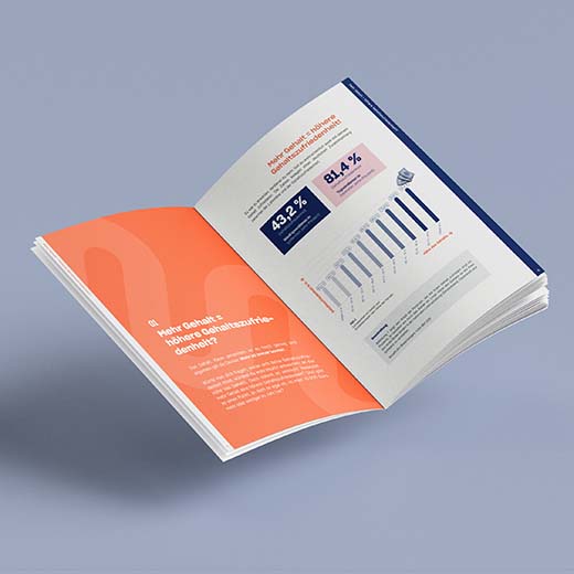
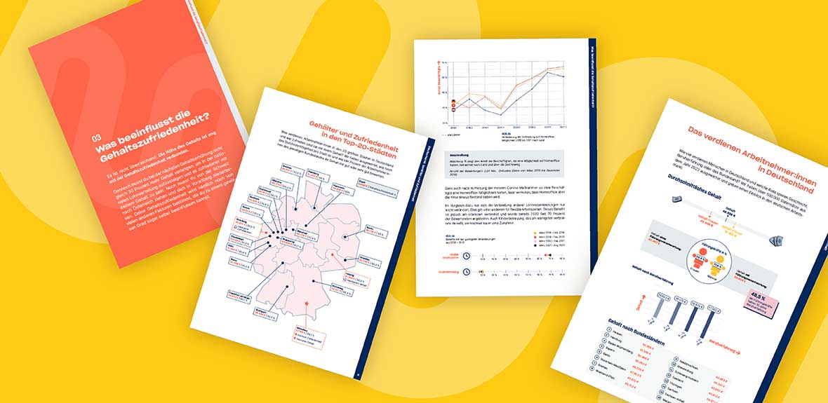
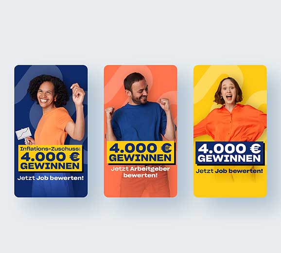
kununu – Europe’s biggest employer rating platform. The vision: Make work better. To work towards more transparent work environments, kununu and I already worked on and launched 2 whitepapers about salary transparency. To make sure as much people as possible profit from kununu, we’ve also work on custom-made campaigns together.

Greens Bistro

The Greens Bistro is the place to be when it comes to regional & vegan feel good food.

It all began with a delivery service, only delivering food in lilac coloured reusable boxes with the claim “full taste, no waste”. Those beautiful lilac boxes also marked the beginning of the visual branding strategy: away from green colours (that sustainable businesses often use), moving to a modern, fresh lilac.

Sandra Loidolt

Sandra is a life coach. Her vision for the future: Everyone can live a good life. With the right tools, you can build yourself a world. A world where you feel a sense of belonging, comfort and happiness.

“Your life is yours to build” is the brand story’s main message. That’s also represented in the logo: friendly shapes, that don’t fit perfectly, but still hold a beautiful balance. The shapes interact with each other, offering support in just the right places.

Alongside the logo, the illustrations continue to tell Sandra’s brand story, bringing her corporate design to life. The illustrations embody a friendly simplicity: the aim is to empower people, while still maintaining a professional distance that is essential to Sandra’s work.

Biohof Sani

Biohof Sani – where animals and plants are treated with respect and love. For this organic farm sustainability and a great sense of responsibility are top priorities when it comes to nature and animals.

All of this is represented in the design approach: with beige and brown tones, accompanied by colourful and friendly illustrations. The design reflects their love for nature, the colours and illustrations bring in an element of innovation that is necessary for real change.

Swat.io

Swat.io is that kind of social media management tool that makes the hearts of social media managers just beat a bit faster. To make sure as much people as possible profit from the product, we work with custom-made campaigns. Besides creative campaigning (like the comic-campaign), the campaigns for Swat.io are often based on current events. Whether that be the football European championship, Olympia or the star wars day.

ANNA-THERESA KRUG

Anna is a female empowerment trainer. Anna’s purpose: “I empower women to build a badass life full of meaning”. Her values: honesty, empowerment and connection. Organic elements in gold and dark-green together with elegant illustrations that show the connection between you and yourself are at the heart of her branding and design.

Her values are also communicated through her business cards: The logo on every card is hand-printed, making each one unique. Just like Anna’s clients – because every woman is special and wonderfully imperfect.

What at first seems rather simple is, at a second glance, not simple at all: The logo represents the different dimensions of Anna’s work. The two circles symbolize two people and therefor the connection between the coach and the coachee. Simultaneously, it visualises the client’s connection to herself.

The organic, dark green and golden elements are essential to Anna’s visual identity. Emerging out of the values “empowerment” and “connection”, they give the designs a beautiful and natural liveliness.