Lunchzeit
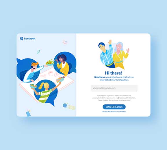
The client: an app, that connects people over lunch. The task: rebranding. The aim: making the app look more modern while still giving off a friendly and inviting vibe. Most of all, users should feel confident that the app will find them their perfect lunch partner.
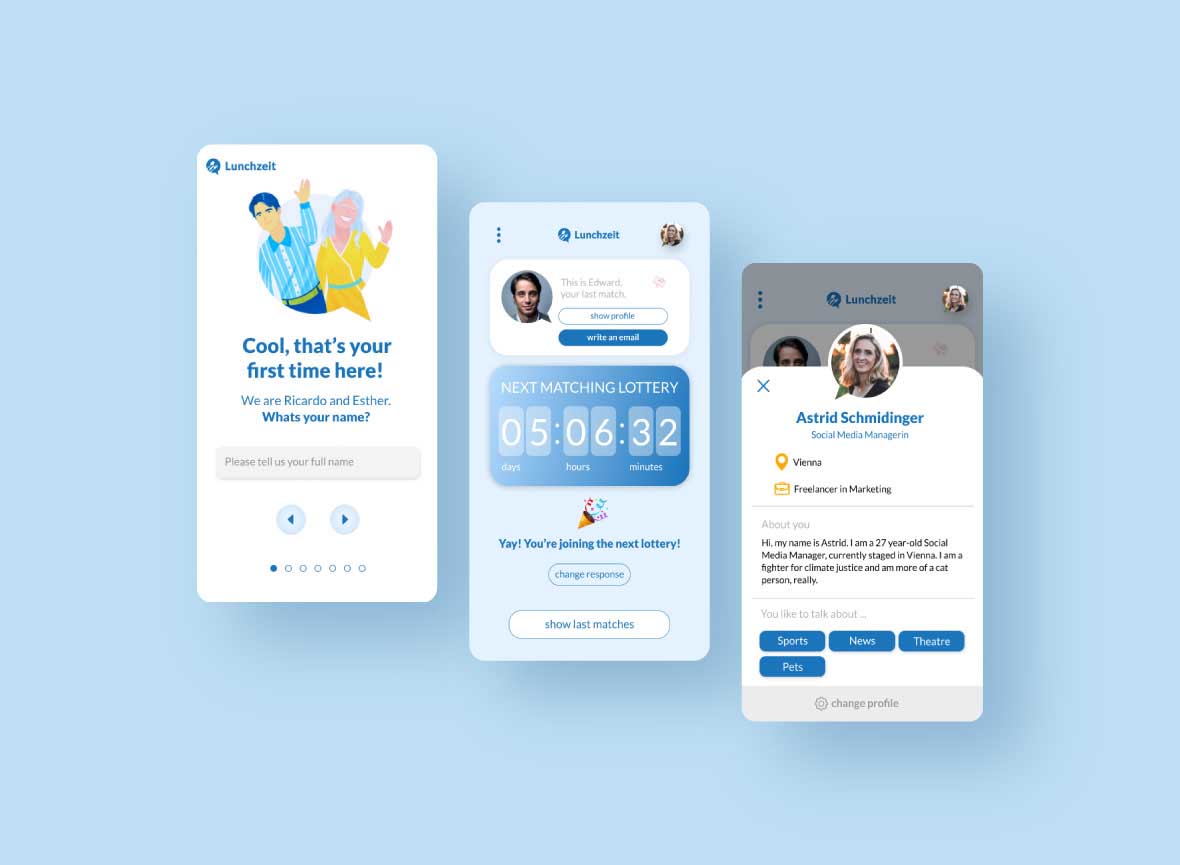
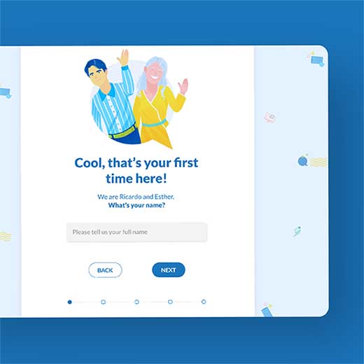
And that’s when Ricardo and Esther come in: both of them guide you through the whole user-flow. Whether you’re just signing in, join the first lunch-lottery or have any questions – they’re here for you and happy to help.
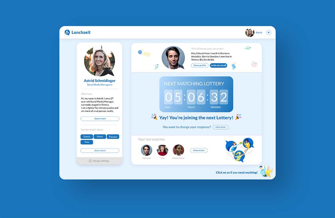
The aim was to keep UI & UX as simple and easy to follow as possible. At the same time, it should look and feel lively and personable rather than a dentist’s website. That’s why I chose to add illustrations to the design. (Note the illustrations are not made by me – the client already had them when he hired me. I just found a purpose for them by introducing Ricardo and Esther to the brand’s story).
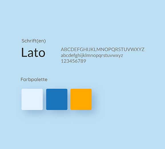
The colour-scheme further supports the vision of the design. I primarily used two vibrant blue tones and a bright yellow for highlights, creating a calm and safe yet playful and warm user experience.